Today I was inspired by my friend, and fellow teamie on the TCP Design Team, Erin Stewart, to get back to art journalling.

- - - - - - - - - - - - - - -
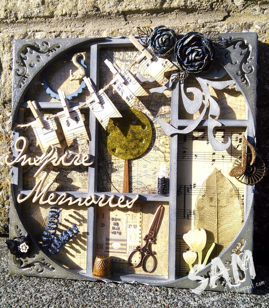
I used the following materials:
MEDIUMS USED: Acrylic paint, white gesso, DecoArt Ultra-Matte Varnish, Archival Ink (Jet Black), Posca Paint Markers (white and black), Molotow Paint Marker (black).
OTHER PRODUCTS USED: Dylusions Journal, various stencils and stamps, used paint tubes, old paintbrush.
OTHER PRODUCTS USED: Dylusions Journal, various stencils and stamps, used paint tubes, old paintbrush.
- - - - - - - - - - - - - - -
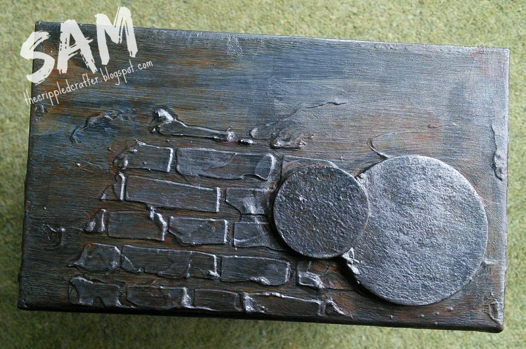
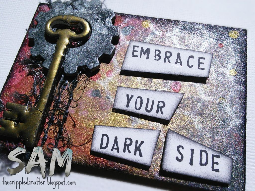
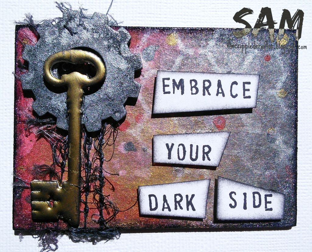
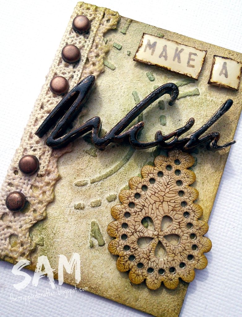
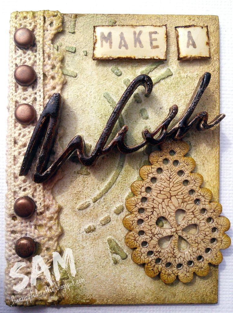
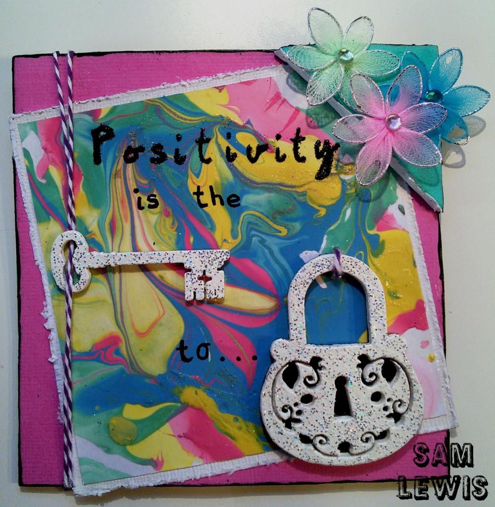
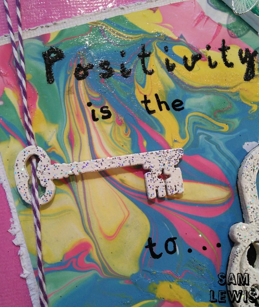
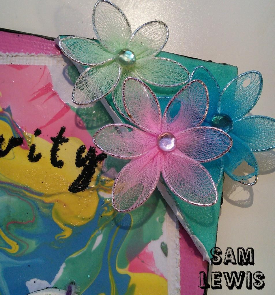
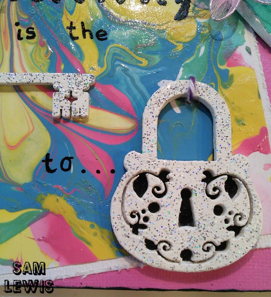
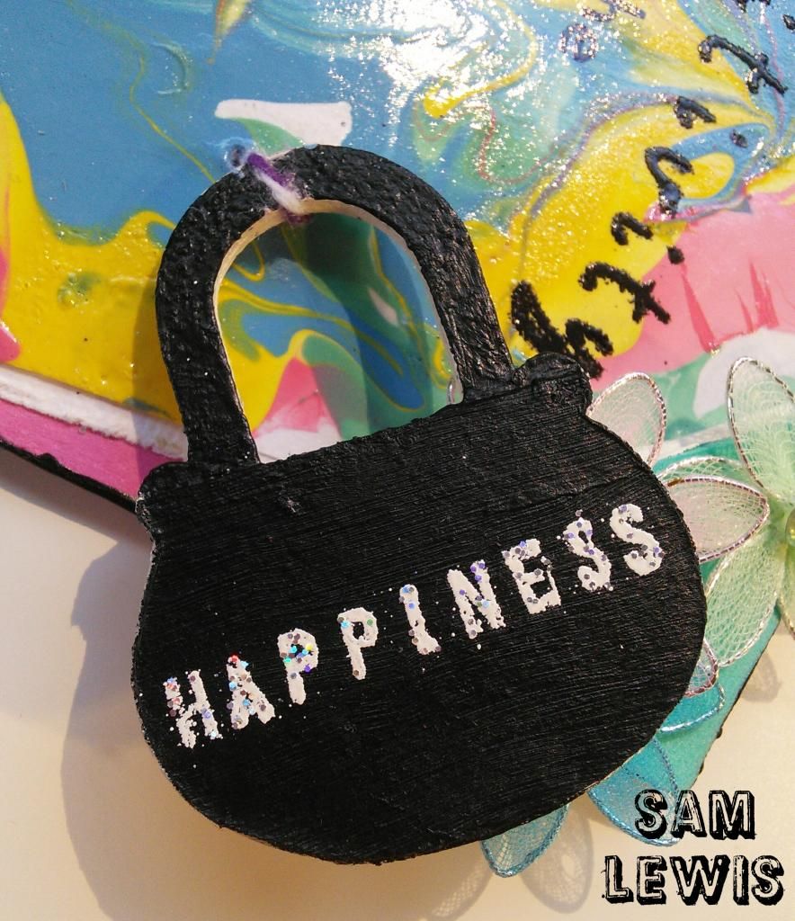
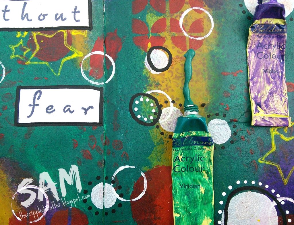
Summary Process:
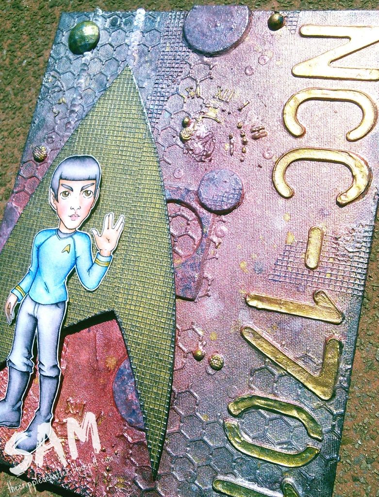
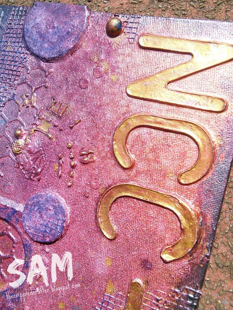
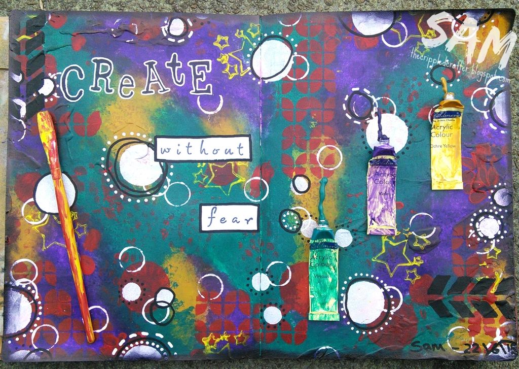
I started this page without any plan as to what I was going to do. I used a page in my Dylusions Journal on which I'd cleaned off some stamps and used some excess texture paste.
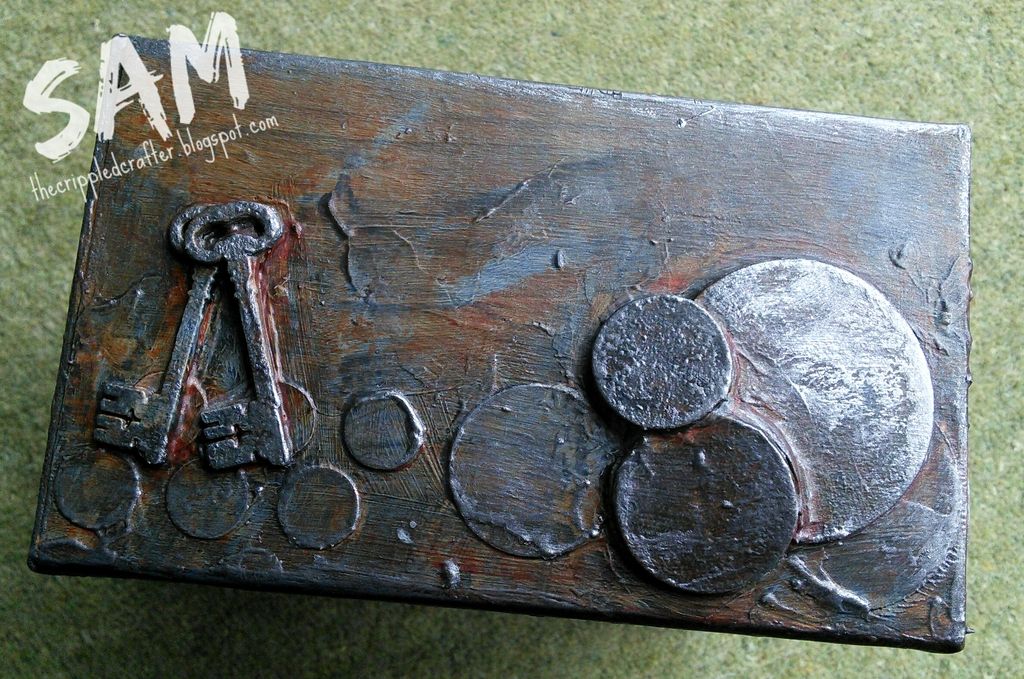
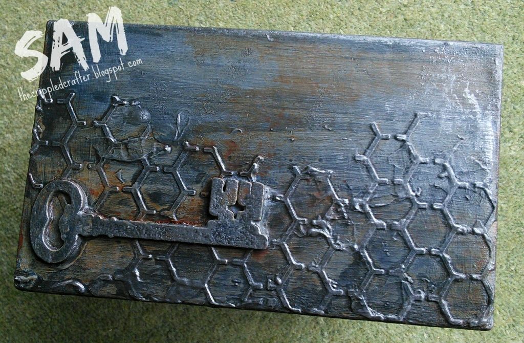
I built up layers of acrylic paint with baby wipes, followed by lots of layers of acrylic paint through stencils and with stamps. I also added circles using a bottle cap.
The sentiment was stamped in Archival Ink and then the whole page was given a coat of Ultra-Matte Varnish by DecoArt.
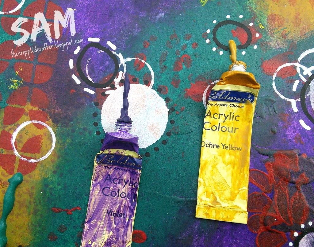
I glued the now empty tubes from the first layer of colour to the right of the page and added an old pair brush to the left.
The page was further decorated with white and black paint markers and finished with Archival Ink in Jet Black around the edges.
- - - - - - - - - - - - - - -
Summary Process:
I started this page without any plan as to what I was going to do. I used a page in my Dylusions Journal on which I'd cleaned off some stamps and used some excess texture paste.
I built up layers of acrylic paint with baby wipes, followed by lots of layers of acrylic paint through stencils and with stamps. I also added circles using a bottle cap.
The sentiment was stamped in Archival Ink and then the whole page was given a coat of Ultra-Matte Varnish by DecoArt.
I glued the now empty tubes from the first layer of colour to the right of the page and added an old pair brush to the left.
The page was further decorated with white and black paint markers and finished with Archival Ink in Jet Black around the edges.
- - - - - - - - - - - - - - -
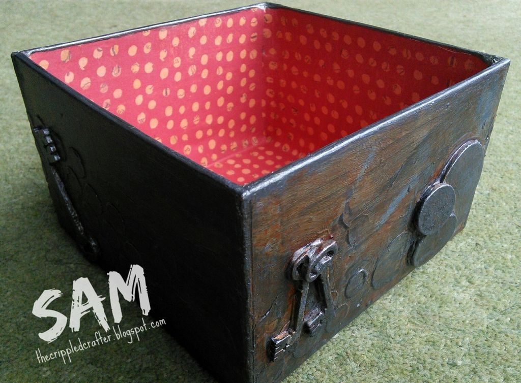
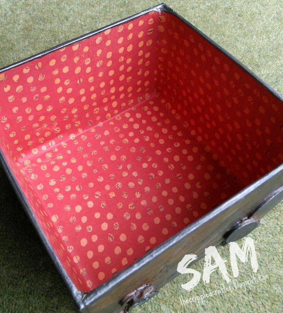
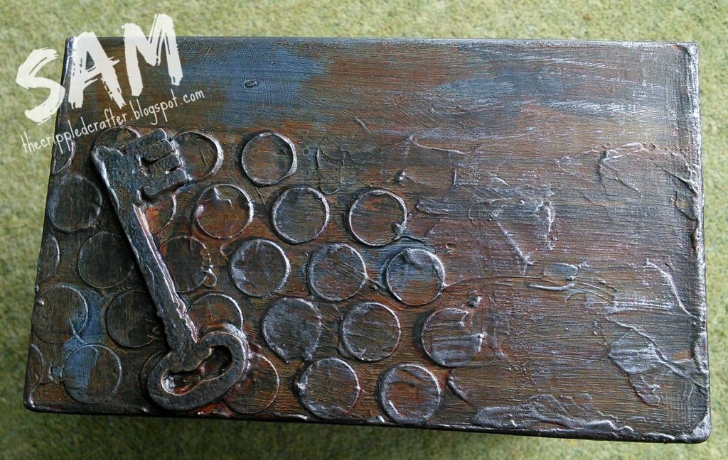
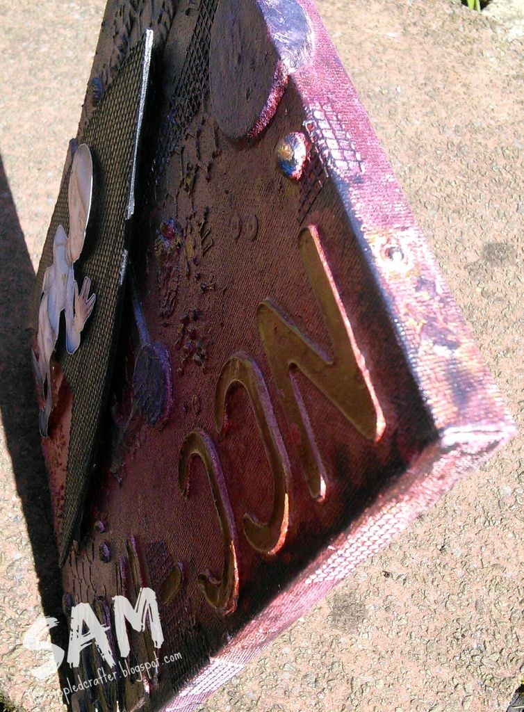
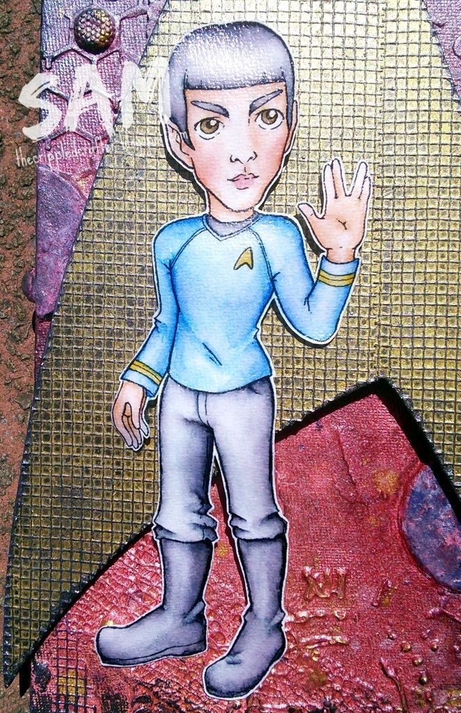
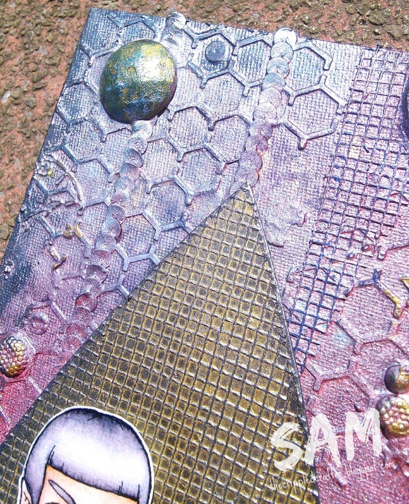
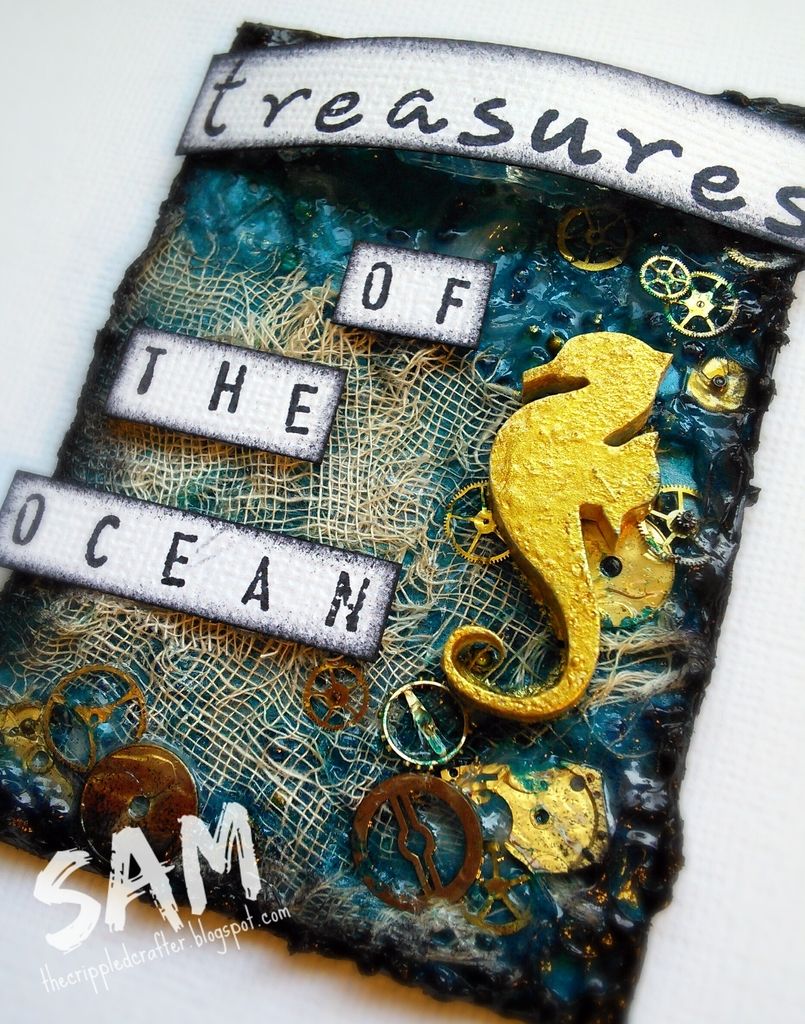
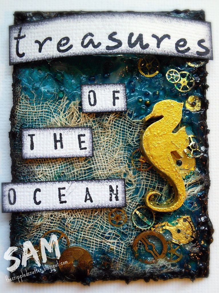
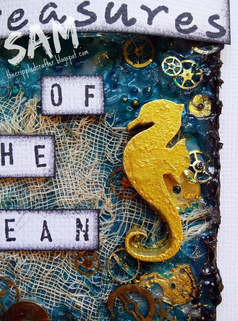
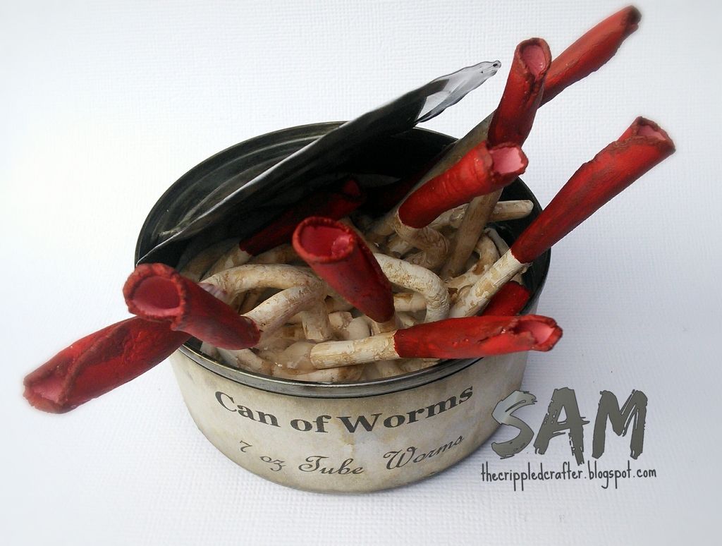
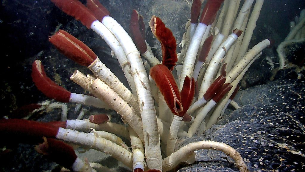
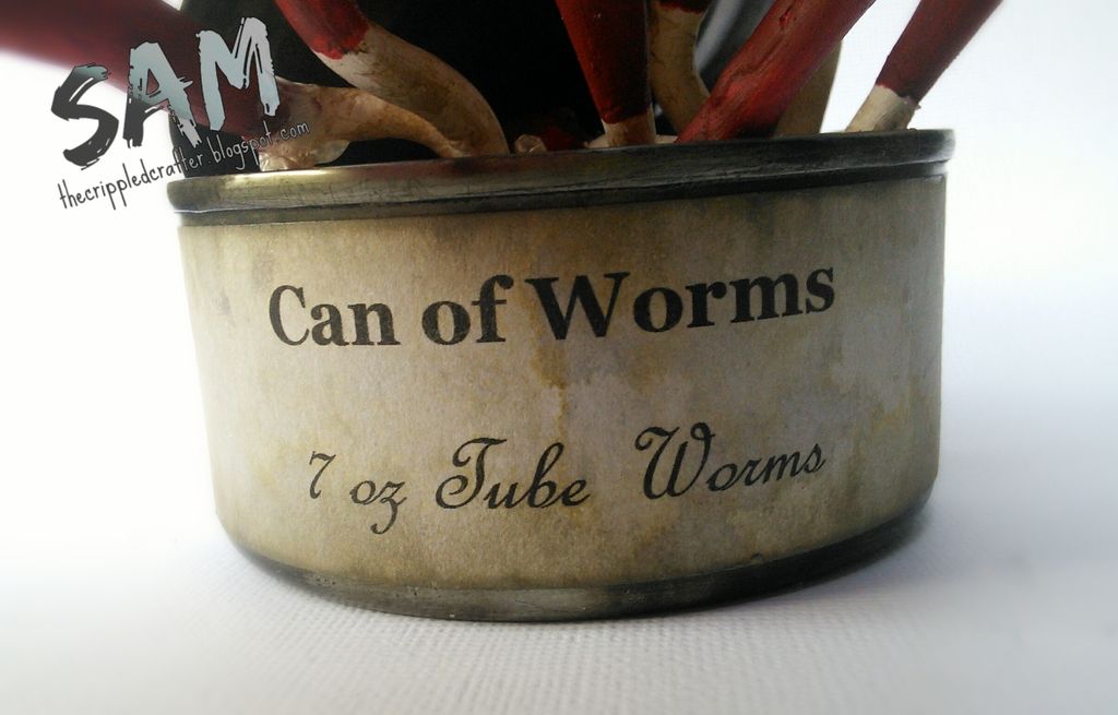
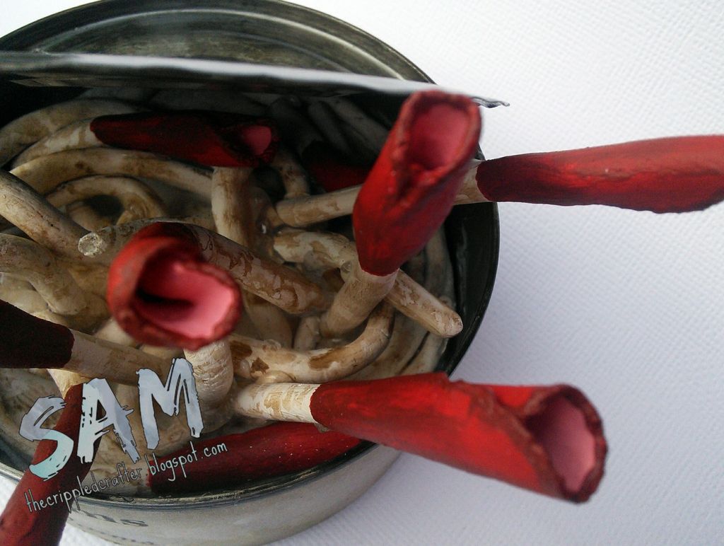
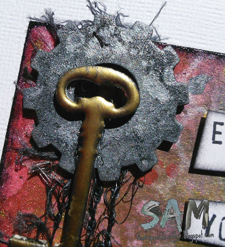
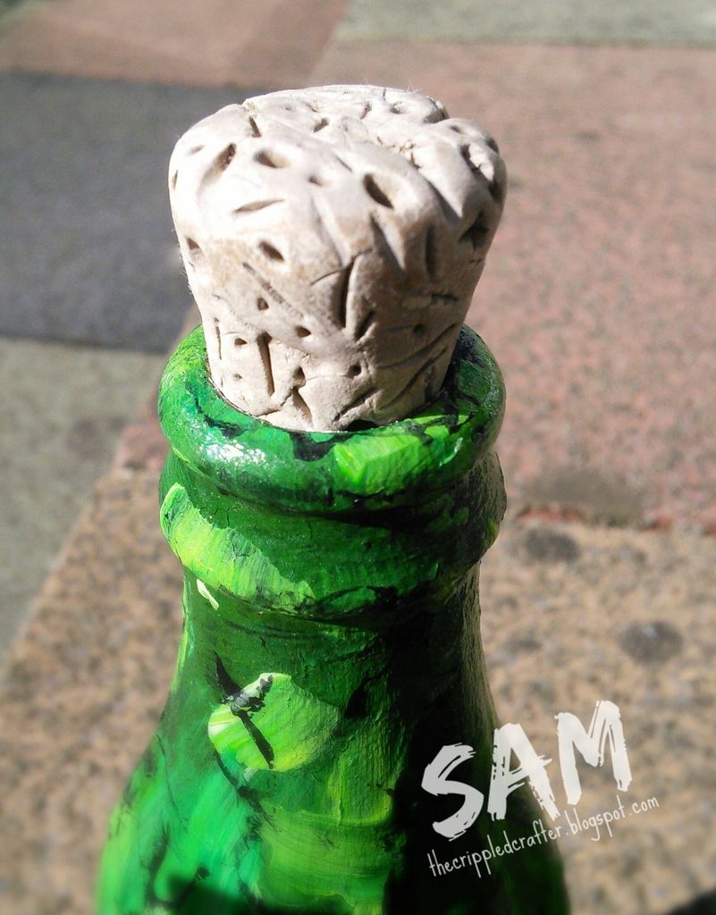
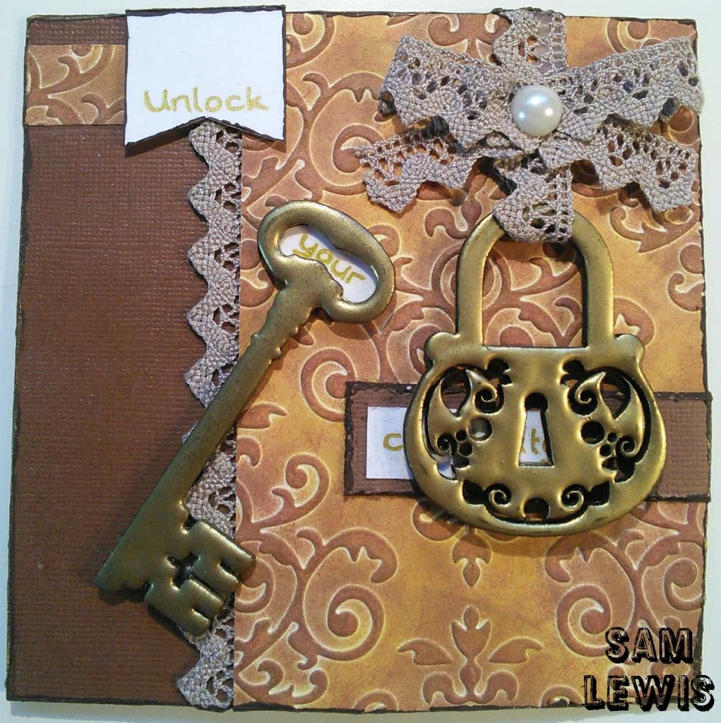
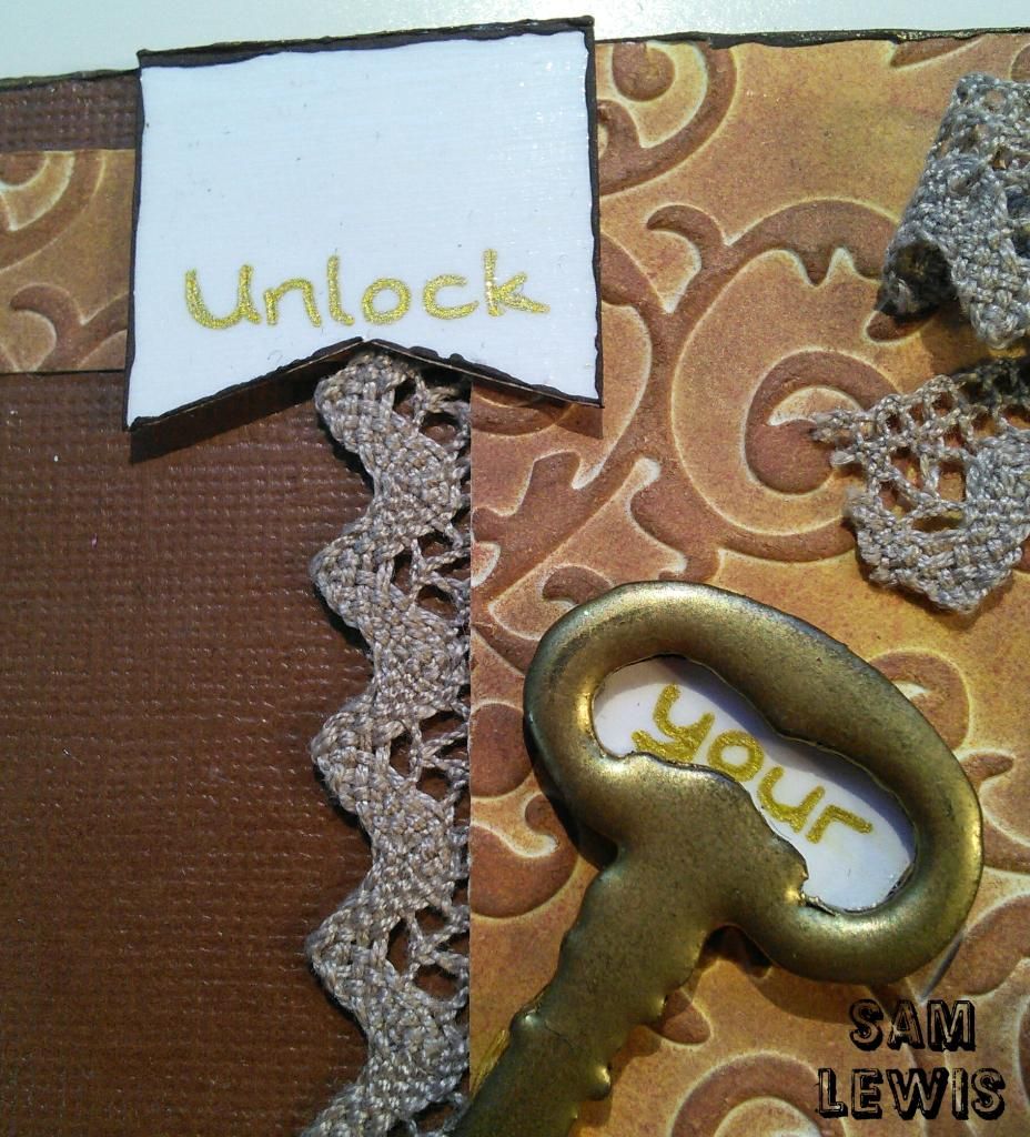
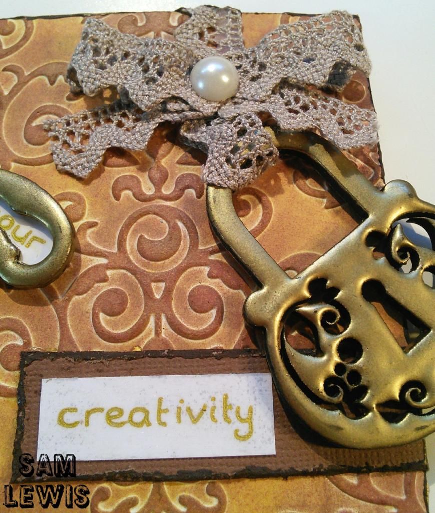
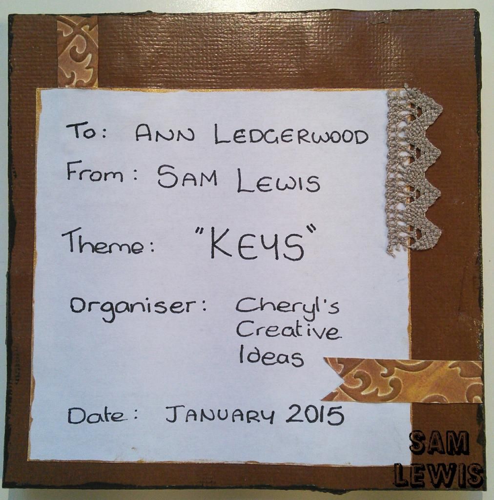
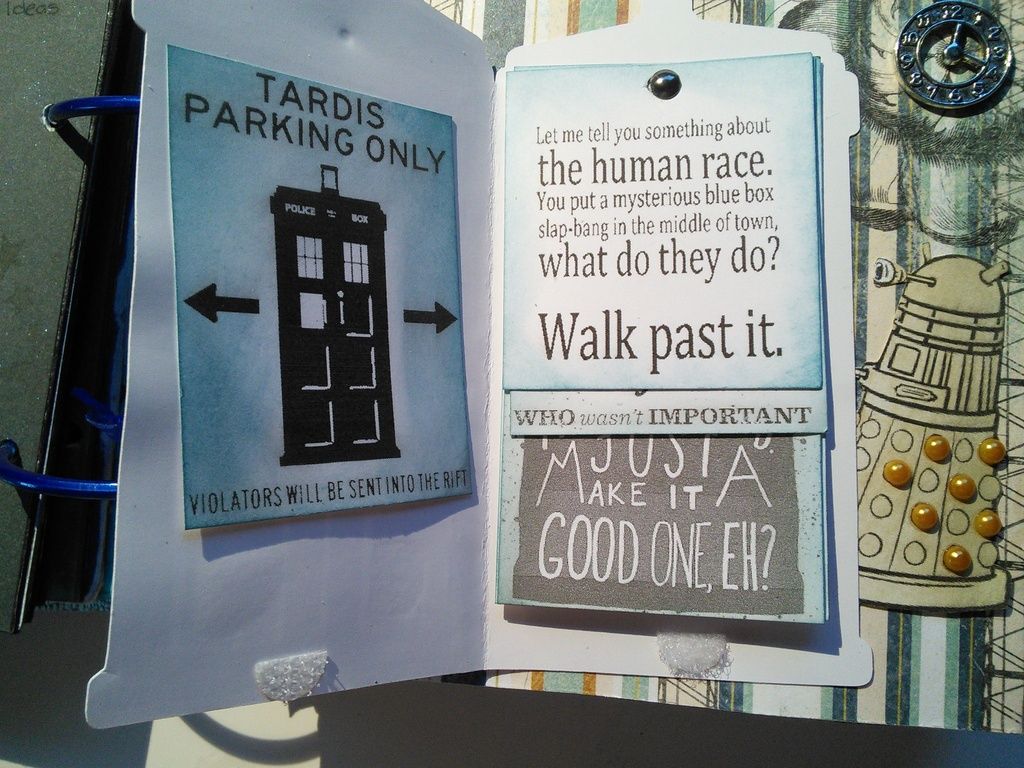
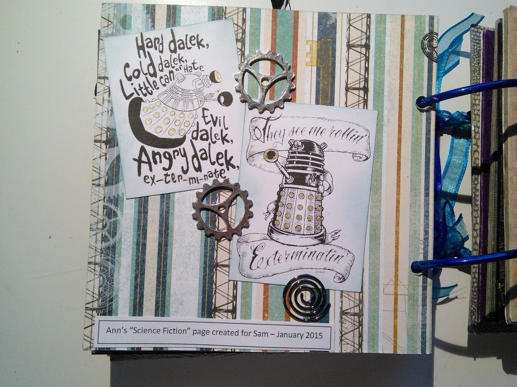
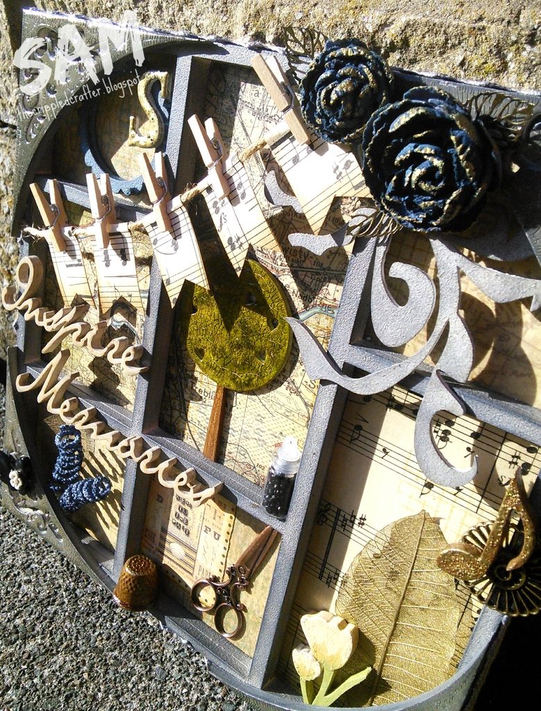
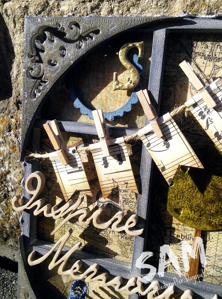
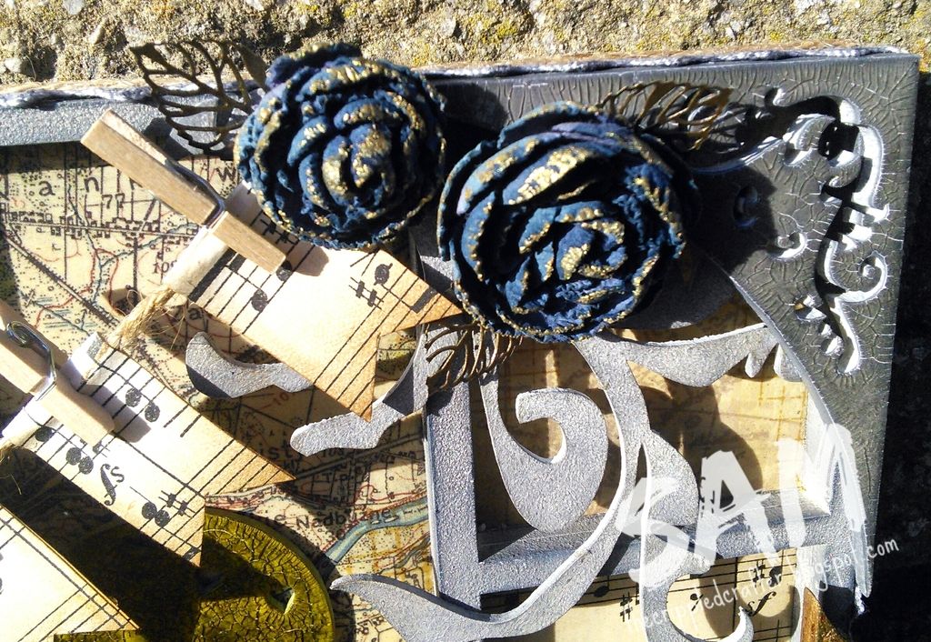
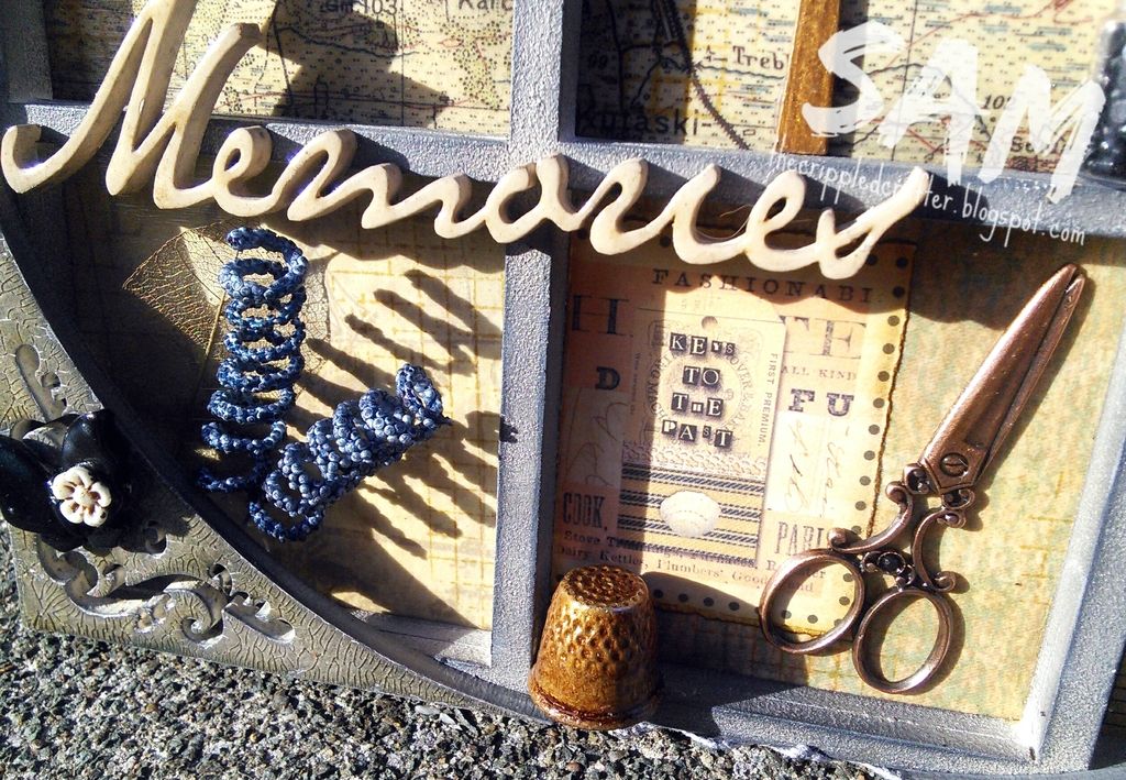
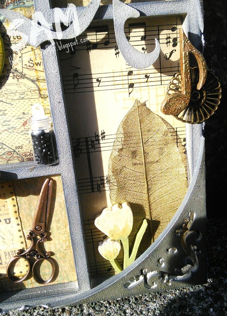
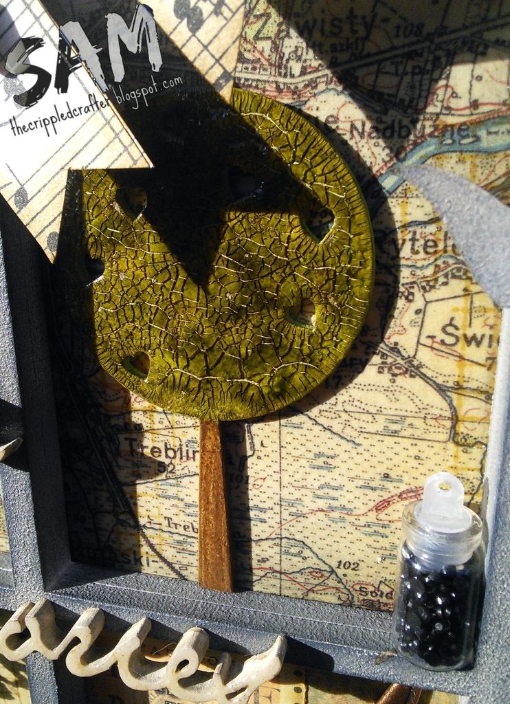
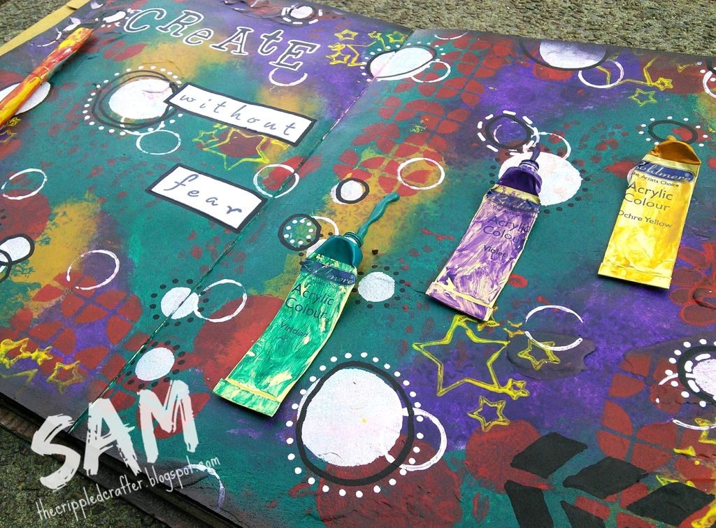
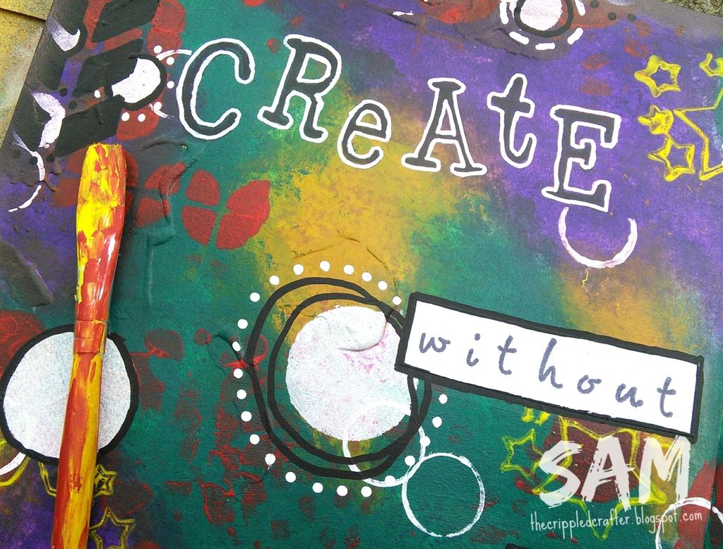
Here are some more photos:
- - - - - - - - - - - - - - -
Thank you as always for popping by.
xxSAMxx